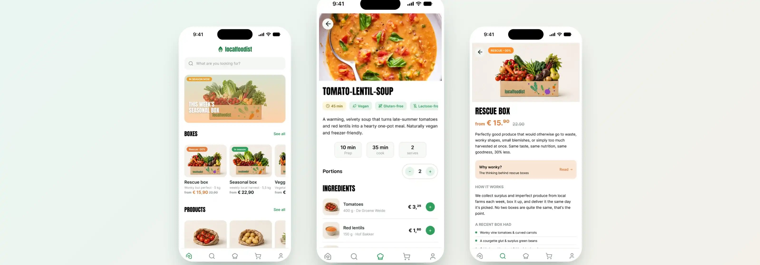
Product Design · Sustainability · Interaction Design
A local food app is easy to make people like. The hard part is making them choose it when a cheaper option sits right next to it. localfoodist started as a university study that found exactly that problem, and became a 2026 product design built to solve it: make the sustainable choice the affordable one, and the rest follows.
People say they care about sustainable, local food. Then they open their wallet and choose the cheaper thing. A green app that ignores this is designing for who it wishes its users were.
The original 2023 project set out to test whether a local-food service could work in Twente. The research kept returning the same uncomfortable answer: when it came down to a real decision, price beat sustainability. People liked the idea of buying local and reducing waste, but the moment a cheaper conventional option was available, that is what they reached for. On top of that, our initial pricing sat too high to compete at all.
This is the trap most sustainability products fall into: they design for the values people report, not the choices people actually make. The interesting design question was not "how do we convince people to care more?" It was "how do we make the sustainable choice the one they would pick anyway?"
Price
beat sustainability
Across concept testing, cost was the deciding factor for most shoppers, even those who said sustainability mattered to them. Stated values and actual choices did not line up.
Too high
Initial pricing
The first pricing tested above what people would pay for local produce, so even interested shoppers hesitated. Affordability was not a nice-to-have; it was the whole game.
Trust
The second barrier
"Local" and "sustainable" are easy to claim and hard to prove. Without something concrete behind the words, the promise reads as marketing, not a reason to switch.
I treated the 2026 rebuild as a real product, not a set of screens: define the flow, design the system, then pressure-test it with realistic content until it felt like something you could actually ship.
Rather than redraw the old concept, I rebuilt it from the information architecture up. The first decision shaped everything else: everything in the app is, or becomes, a box. Whether you pick a curated box or add loose products as you browse, your order is bundled into a box in the cart. That single idea kept the whole product conceptually consistent, no parallel "cart versus box" logic to explain.
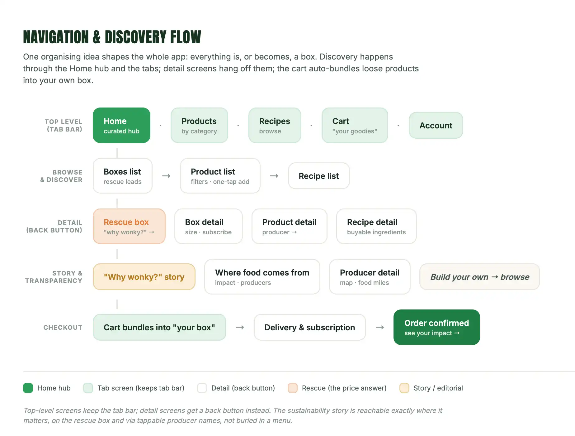
The core navigation and discovery flow the whole app is built around.
On top of that flow sits a full component system, over fifty components built in Figma with variants, states, and auto-layout, so they behave like real UI rather than static drawings. Two rules keep it coherent: tappable filters stay visually distinct from informational tags, and every product, loose or curated, resolves into a box. The boards below are a representative slice, not the full library.
The system spans the whole journey: discovery components (item cards, box cards, section headers), shopping and cart components (list rows, the stepper that doubles as the add-to-cart control, cart summary), configuration (size, frequency and start dropdowns, delivery slots, the subscription block), and the pieces that carry the concept, honest stock states, the rescue box item, delivery nudges, and the sustainability impact panel.
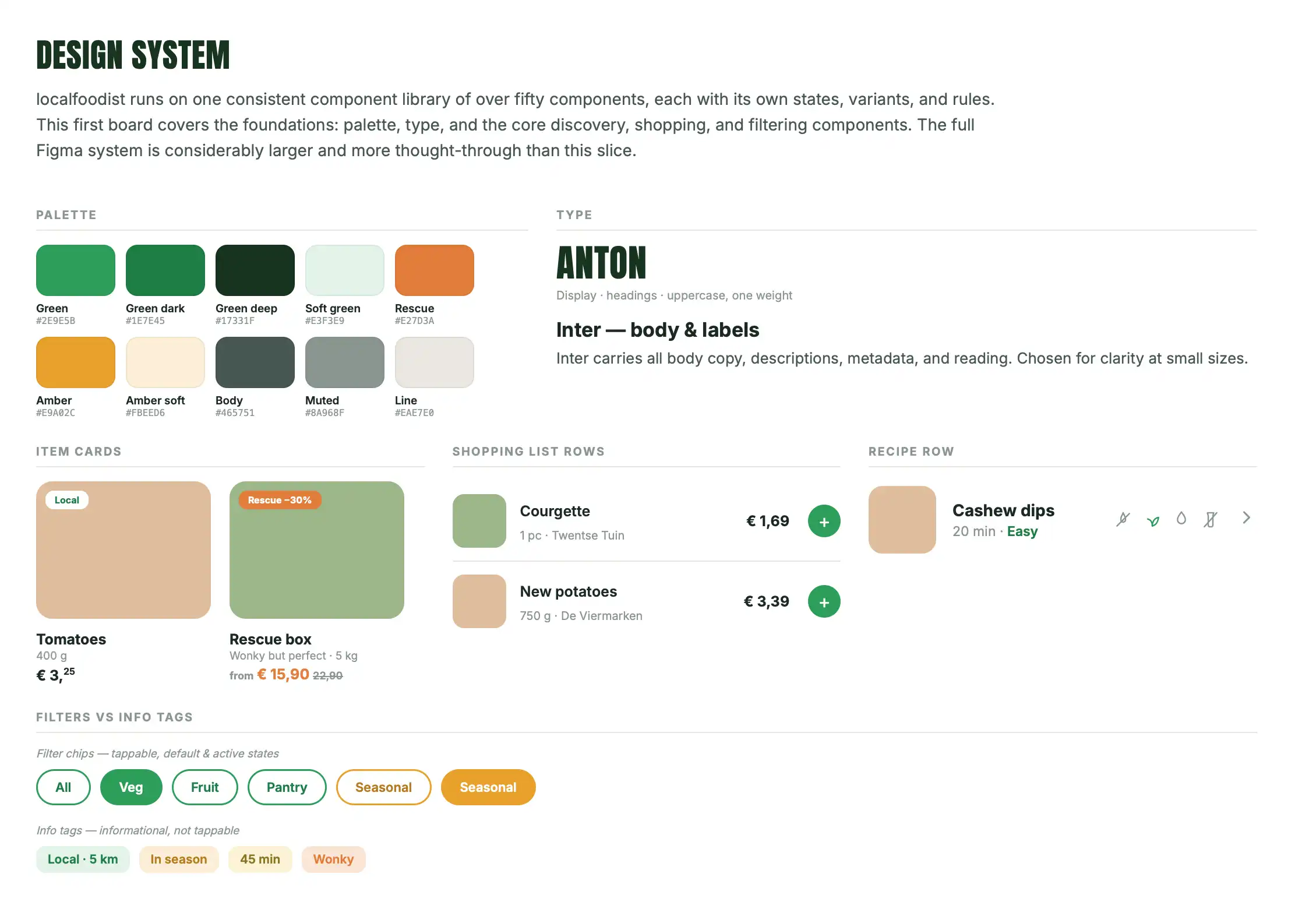
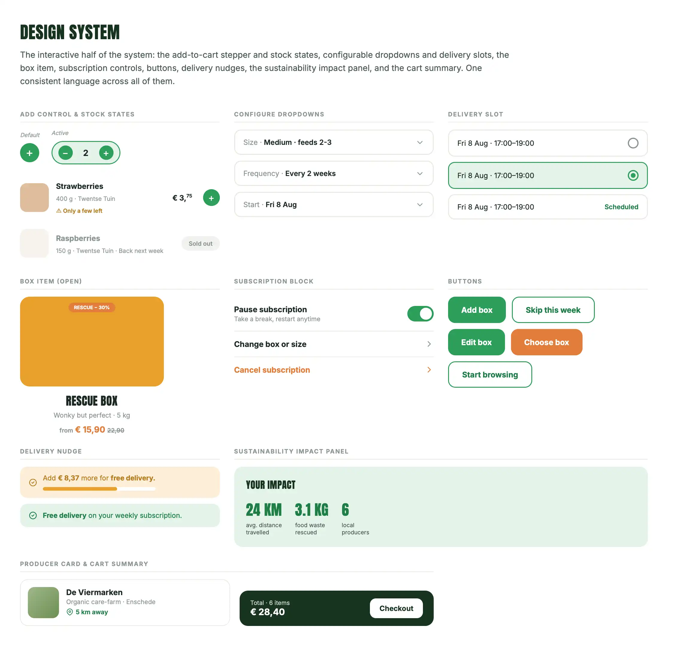
Foundations on the left (palette, type, cards, filters); interactive pieces on the right (steppers, stock states, dropdowns, delivery, impact).
Every screen in the prototype is built from these components rather than drawn one-off, so the system had to hold up in practice, not just look tidy in a library. With that in place, the part that mattered most for believability was real content.
I wrote a genuine catalogue, over fifty seasonal Twente products with real weights, prices, and named local producers, a full recipe with method and buyable ingredients, six box types, and honest stock states. A prototype where every product is a placeholder "Tomato" reads as a mockup. One where you can scroll a real seasonal range, see something sold out, and tap through to the farm that grew it reads as a product.
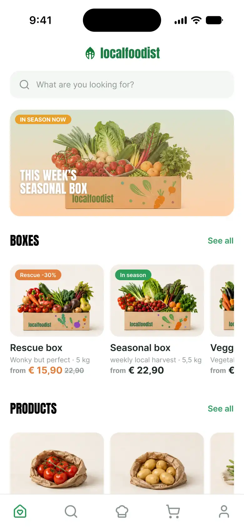
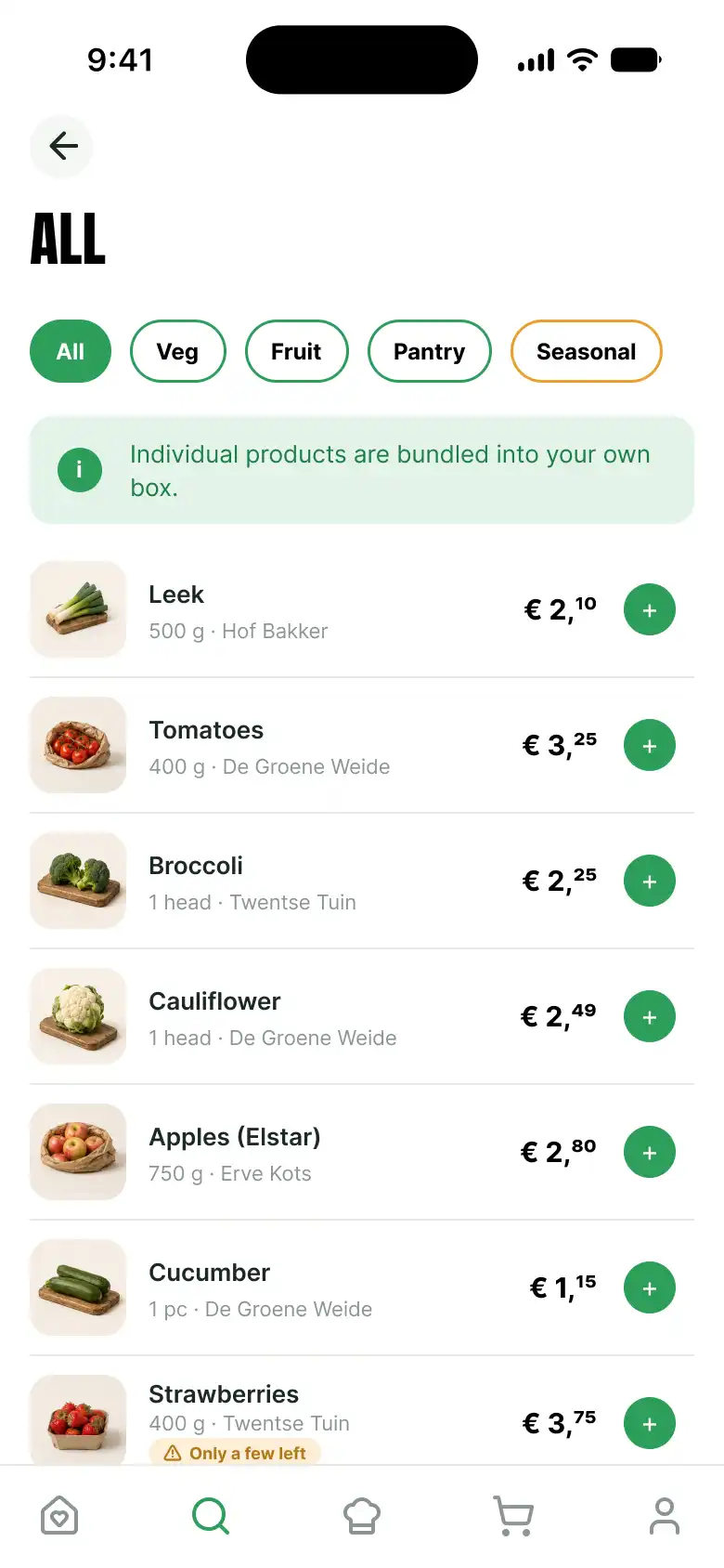
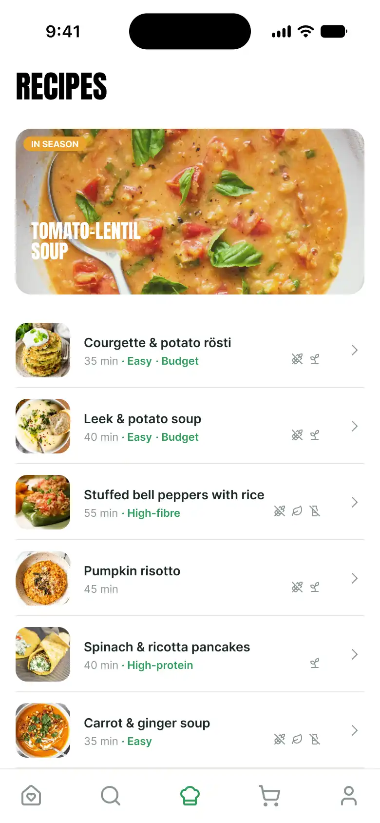
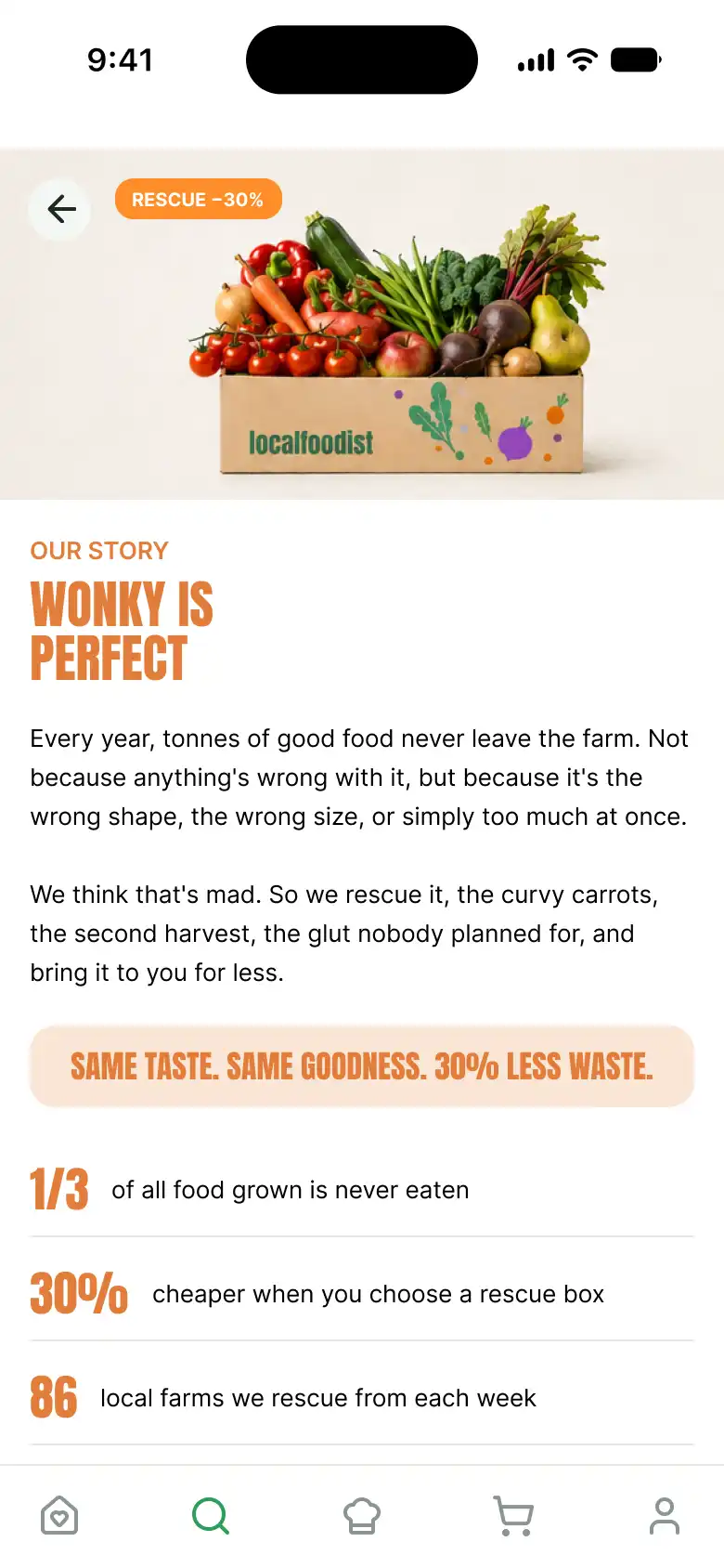
The research finding was not solved by one feature. It was solved by a handful of connected decisions, each removing a specific reason someone would not switch.
The rescue box is the decision the rest of the product is built around. It is a box of "wonky but perfect" produce, surplus, odd-shaped, or slightly blemished food that would otherwise go to waste, sold at 30% less. The idea is simple: if the sustainable option is also the cheapest one, people no longer have to choose between the two. The sustainability story sits right on the rescue box, where the decision actually happens, rather than tucked away on a separate page.
The original research also pushed the concept past "just farms". localfoodist sources from farms and from small local shops with surplus stock, which widens the available range and makes the rescue-and-reduce-waste idea more workable. It is a small shift in scope, but it strengthens the premise.
Not everyone wants a pre-set box, so the app lets you build your own. Rather than bolting on a separate builder, adding loose products as you browse simply is building your box, the cart bundles them for you. It gives people full control without introducing a second way of thinking about the cart.
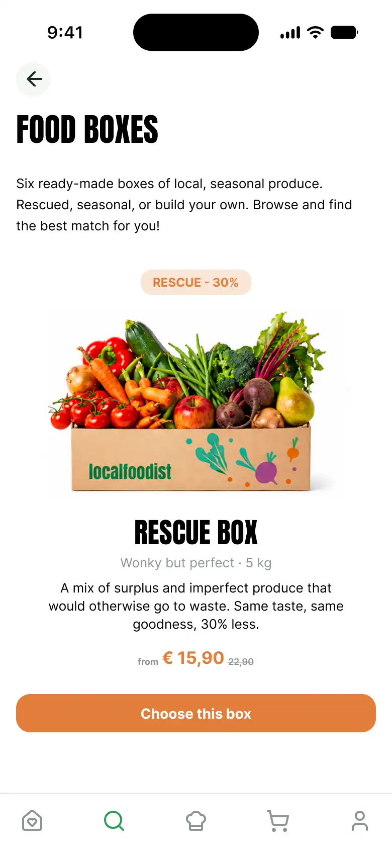
Subscriptions help a business like this, but forcing one is a barrier to a first order. So the app never requires it: you can order once, or subscribe (every 1, 2, or 4 weeks) if it suits you. One-time is the default, the lower-commitment path, with subscription offered as a benefit rather than a wall.
Local delivery has real costs, so rather than hide them the pricing tries to do something useful with them: €3,95 flat, free over €35, and free for weekly subscribers. The cart gently nudges you toward the free-delivery threshold. The intent is for the delivery structure to reward the behaviours that make a small local operation viable, larger baskets and recurring orders, without feeling pushy.
Transparency
Tap any producer
Every product names its producer, and tapping through opens a real profile: who they are, how far away, what they grow. It turns "local" from a claim into something you can inspect, answering the trust barrier directly.
Honest stock
Sold-out, not hidden
When something sells out it is shown greyed with "back next week", not removed. Low stock gets a gentle "only a few left". Scarcity is the honest reality of seasonal local food, so the design treats it as a feature, not a flaw to hide.
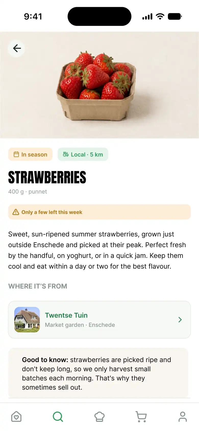

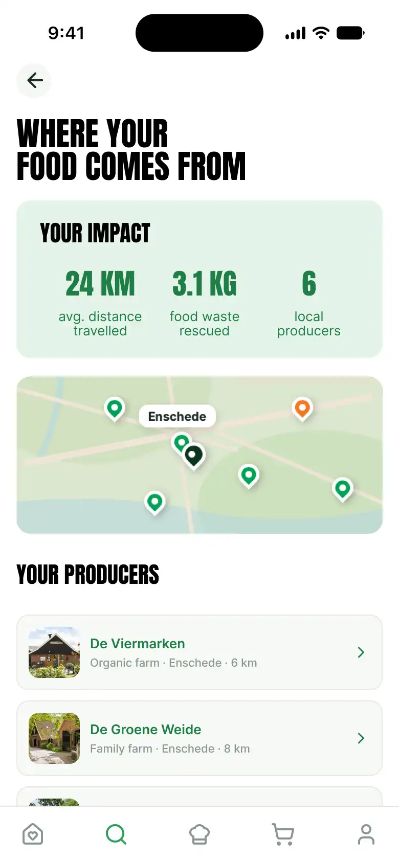
A complete, interactive product concept that answers one research finding consistently, in the interface, the content, and the way the service is priced.
localfoodist is a design concept, taken far enough to be tested rather than just shown: a real research finding, a product built to answer it, and a prototype detailed enough to actually use. Where I could, I let the same finding about price, values, and trust guide the decisions, from the rescue box down to how delivery is priced.
The trade-off
Removed, not argued
Instead of trying to convince people to value sustainability more, the design makes the sustainable option the cheap and easy one, so the choice stops being a trade-off at all.
End to end
IA to interaction
Information architecture, visual system, real content, business model, and a working prototype, designed as one coherent product rather than a set of screens.
Believable
Real content throughout
Real producers, real seasonal range, real prices, real stock states. The realism is what lets the prototype be judged as a product, not a mockup.
Because it is a concept, the honest next step is testing. If I took it further, this is what I would want to learn:
Does the "everything becomes a box" model read as intuitive, or does auto-bundling loose products surprise people at the cart?
To test · Onboarding & mental model
Does offering one-time ordering actually lower the barrier to a first purchase, compared with a subscription-first flow?
To test · Conversion
Do the transparency and producer pages genuinely build trust, or do people skip straight past them to checkout?
To test · Trust & engagement
Does the free-delivery threshold change basket size the way the pricing intends, without feeling manipulative?
To test · Business model
What this project reflects about how I work:
Product thinking
A research insight is only useful if the design answers it
It would have been easy to make a pretty local-food app. The harder, better work was letting one finding, price beats sustainability, drive every real decision, including the ones outside the interface. The rescue box, the delivery pricing, and the subscription model are all the same insight, expressed in different places.
Business + design
Designing the model alongside the interface
Delivery fees, free-shipping thresholds, and subscription perks are not "someone else's job". They shape behaviour as directly as any button. Designing them together with the UI, rather than after it, is what made the concept hold together as a real product.
Realism
Real content is what makes a prototype honest
Placeholder content lets you dodge the hard questions. Writing a real catalogue, with real producers, prices, and sold-out states, forced the design to survive contact with reality, and made the prototype something you can actually judge.
Craft
Deepening the tools, and enjoying it
Building this deepened my Figma prototyping craft considerably, interactive components, variants, smart-animate, scroll behaviour, and the small logic problems that make an interaction feel real. It also confirmed something: this hands-on, make-it-actually-work side of design is the part I find genuinely exciting.
The best way to judge it is to use it. Try the interactive prototype →